
We use cookies to improve your experience on our website. By continuing to browse this website, you agree to our use of cookies. For more information, please refer to our privacy policy.

In business, the only thing that ultimately matters is whether your product is the one consumers end up putting in their physical or virtual shopping carts.
The vast majority of shopping decisions are quick, intuitive, and subconscious, with shoppers switching to ‘autopilot’ when faced with the unassailable task of evaluating every one of the many thousands of products in-store. Adopting a behavioral-led framework enables marketers to navigate the complexities of the consumer mindset in this environment and ultimately win at shelf.
The 3Cs predict packaging success and provide marketers with certainty around the impact of shopper marketing decisions. But how exactly do you create packaging that Captivates, Connects, and Compels shoppers at the point of purchase? We’ve drawn upon the extensive learnings amassed from testing thousands upon thousands of packaging designs across the world, and distilled them into the Packaging Effectiveness Playbook: The 9 keys to designing packaging that wins at shelf and drives shopper growth.
For a packaging design to have the best chance of in-market success, these guidelines should be shared far and wide with all key stakeholders as early as possible in the design process. Use these learnings to ensure your next packaging project delivers on objectives and ultimately results in business profitability. And, if ever in doubt, test with confidence using the 3Cs!
With a decade’s worth of experience under our belt, we’ve accumulated a wealth of knowledge about what works and what doesn’t when it comes to packaging design. Our 3Cs framework disentangles the behavioral and psychological drivers of shopper decision making, addressing the two primary hurdles a packaging design must overcome in order to get into shopping baskets:
Shopper Challenge #1: Shelf Impact
Break through the competitive clutter at shelf and attract shopper eyeballs (Captivate) while being quickly and easily identifiable for the brand (Connect).
Shopper Challenge #2: Compel
Convince people it’s worth choosing over other alternatives by highlighting compelling benefits.

Read more about the importance of getting packaging design right
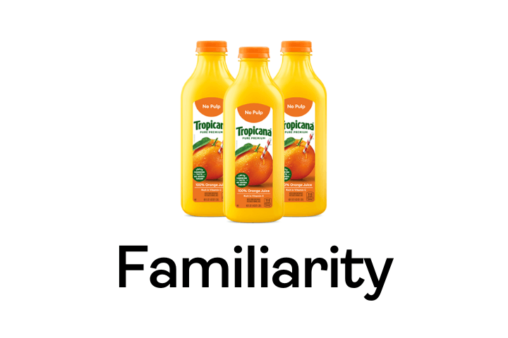
Shoppers spend little time deliberating at shelf and almost instantly identify the brand they’re going to buy. Therefore, the quicker you’re seen and recognized, the more likely you’ll be bought.

When everyone’s zigging, zag. This can attract shoppers’ attention and aid shelf stand out. A novel design or unique format/structure can elevate you above the competitive clutter.
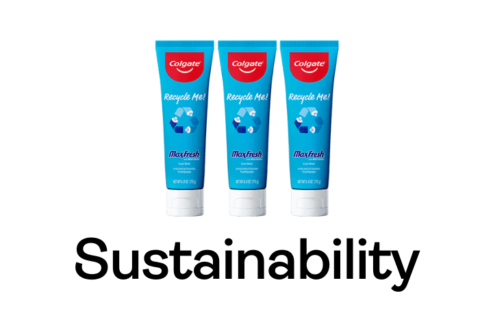
Sustainability is fast becoming ‘table stakes’, so it’s crucial that brands get it right. Carefully manage the associated drawbacks and ensure eco-initiatives don’t detract from the most important drivers of purchase.

Emotion is a proxy for the fast and instinctive ‘System 1’ way shoppers make decisions. The more you make people feel, the more likely you’ll be seen and bought. Prioritize evocative imagery over written claims.
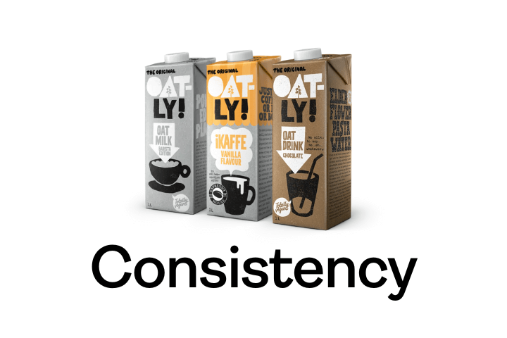
Packaging is more effective when it synergizes with the brand’s wider communications. Deploying recognizable elements creates a multiplier effect, leading to fast and instinctive buying decisions.
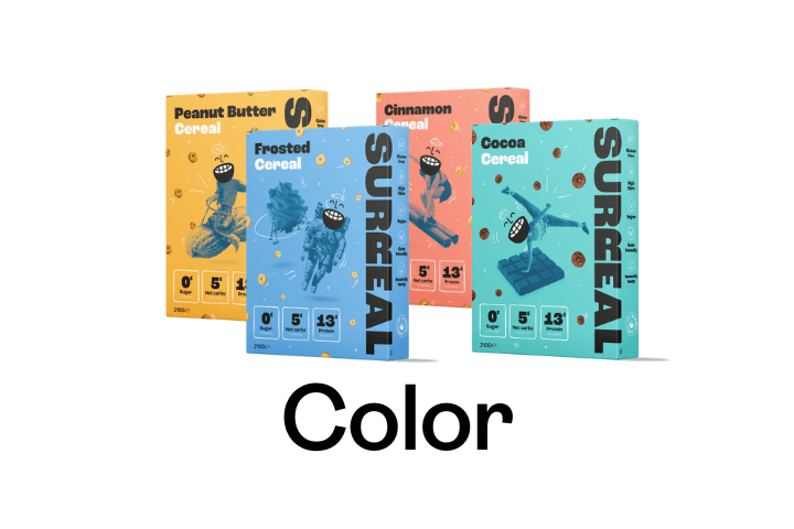
Color is the first thing shoppers notice at shelf, so a unique hue can draw eyeballs and set you apart. With the potential of also becoming a distinctive property over time, it enables busy shoppers to easily find you.
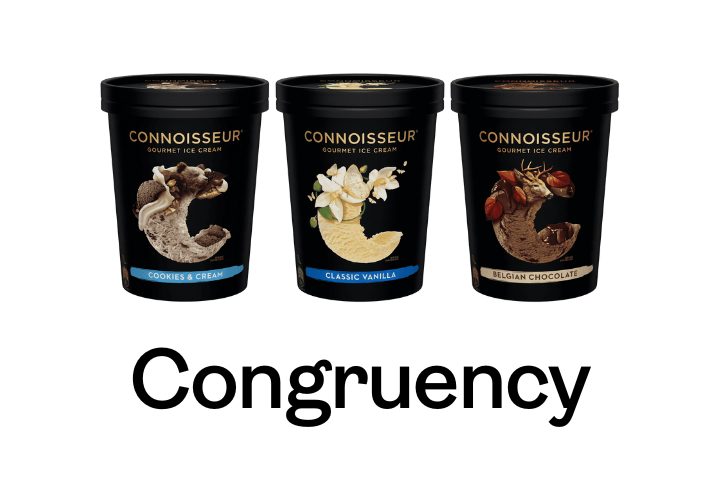
Packaging’s visual and structural elements must be cohesive with one another and ‘speak the same language’. This helps strengthen the associations and ideas that are ultimately seeded in shoppers’ minds.

By adopting as many consistent visual elements as possible across a product line/range, it enables: 1. Easy brand identification (by creating a visual block at shelf); and 2. Easy variant navigation.
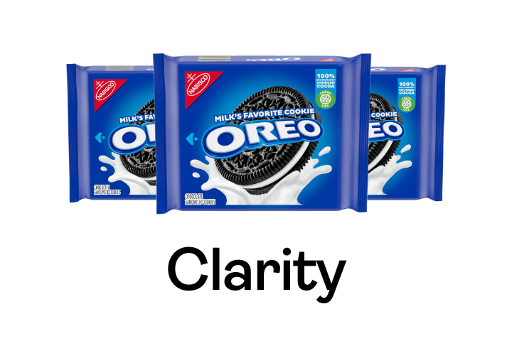
Most decision making relies on simple heuristics and mental shortcuts, with packaging processed largely unconsciously. Eliminate clutter and prioritize the single most important/relevant claim to the target audience.